Colors are one of the most important roles in website design. They affect not only aesthetics but also user experience and brand recognition. Therefore, choosing and using colors smartly and reasonably will help a website look professional and reliable, which increases the credibility and trust of customers in the brand.
What color hierarchy in website design means?
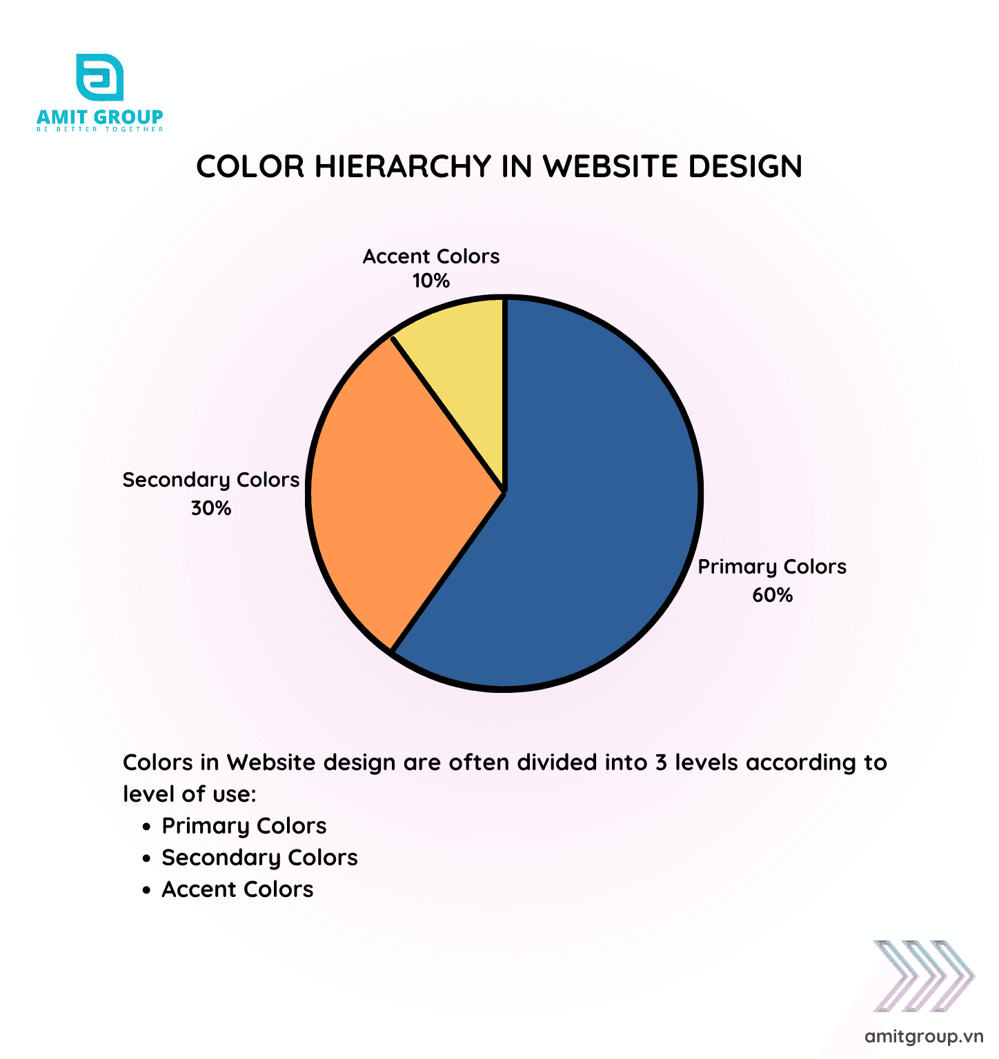
Color hierarchy in website design is an essential technique to create a cohesive, user-friendly, and attractive interface. Here are the three main color groups in website design and how to apply them:
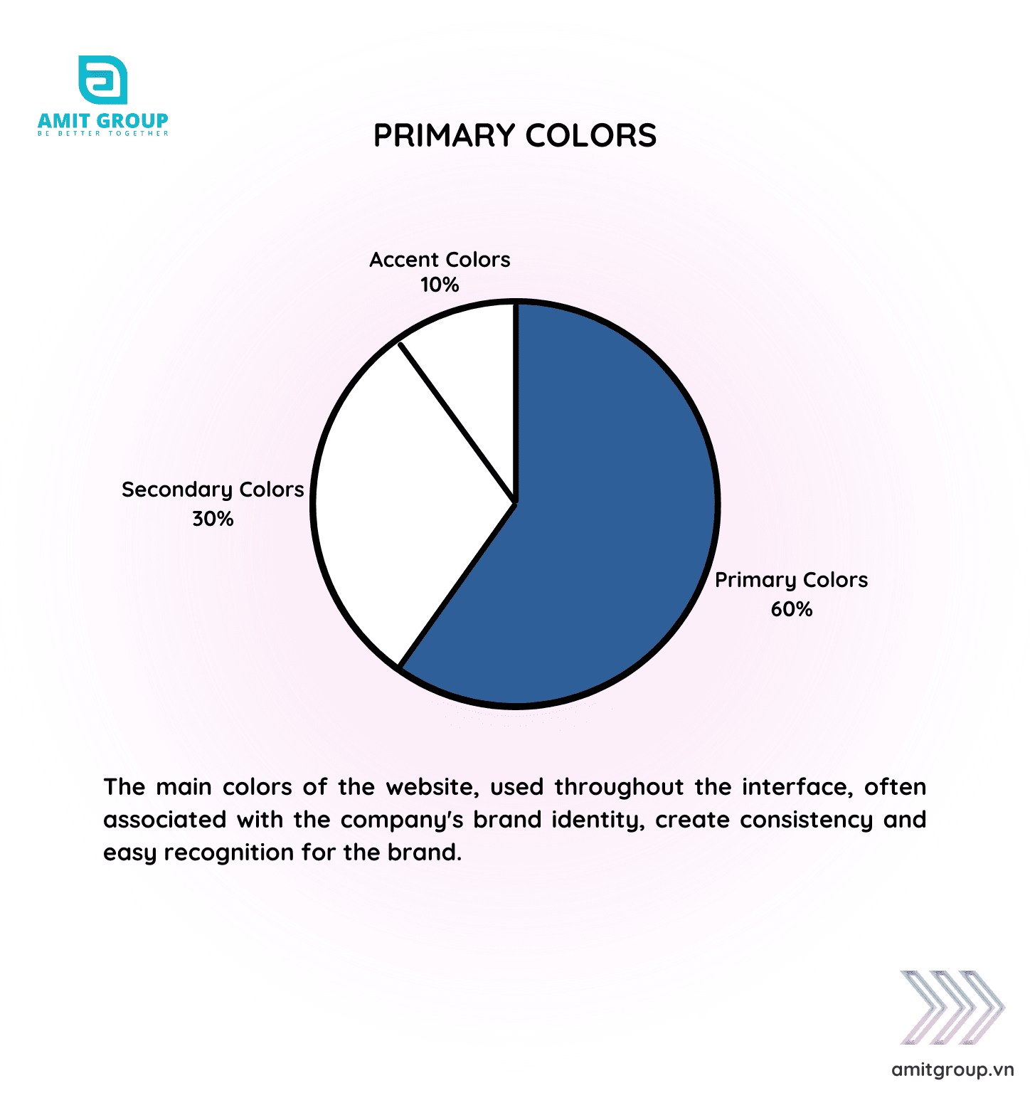
Primary Colors
-
Definition: The main colors of the website, used throughout the interface, often associated with the company's brand identity.
-
Purpose: Create consistency and easy recognition for the brand.
-
Example: If the brand's primary color is blue, this color will appear on the logo, header, and other important elements.
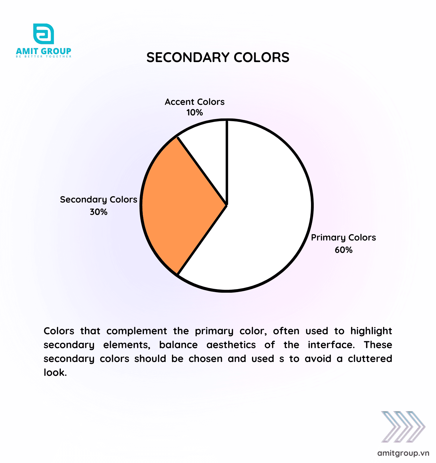
Secondary Colors
-
Definition: Colors that complement the primary color, often used to highlight secondary elements, balance aesthetics of the interface. These secondary colors should be chosen and useds to avoid a cluttered look.
-
Purpose: Increase differentiation and make the interface more obvious.
-
Example: If the primary color is blue, the secondary colors could be green or orange to highlight buttons or important information sections.
Accent Colors

-
Definition: Colors used for small details like buttons, links, or interactive elements to draw user attention and emphasize important information.
-
Purpose: Attract attention and guide users to perform specific actions on the page. Accent colors increase the interactivity and aesthetic of the interface.
-
Example: Red or yellow can be used as accent colors for buttons like "Sign Up", "Buy Now", or important notifications.
Structuring and suitably using these colors will help create a unified, balanced, and interesting website interface. This not only increase aesthetics but also contributes to a better user experience about website design.
Share post
Blog categories