Have you ever struggled to read content on a website due to poor contrast? Contrast not only affects readability but also influences user access and experience (UX). In this blog, we will guide you on how to check your website's contrast, an essential factor in modern web design and also explain why contrast is important, provide useful contrast checking tools, and guide you on how to comply with contrast regulations to enhance user experience.

WEBSITE CONTRAST CHECKER TOOLS
What is a Website Contrast?
Website contrast is the level of difference in color and brightness between text and background, or between different elements on the webpage.
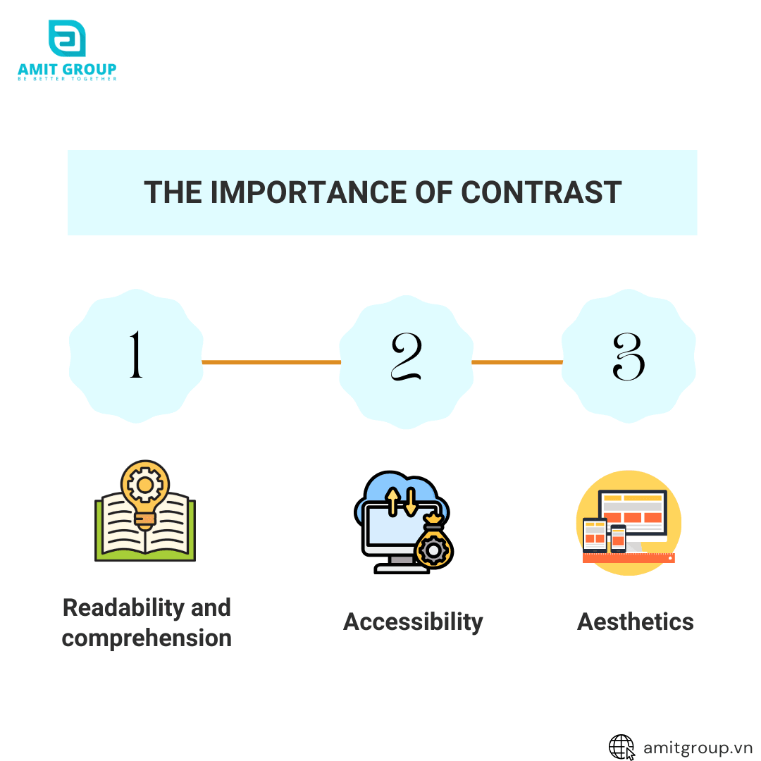
Why is Contrast Important?

- Readability and comprehension: When text and background have a significant difference in color and brightness, users do not have to strain their eyes to read, which helps reduce eye fatigue and increases information retention. This also stands out buttons and other crucial UI elements, making it easier for users to interact and perform actions on the website. For content-heavy websites, ensuring high contrast is extremely important to maintain user attention and minimize reader fatigue.
- Accessibility: Users with visual impairments, such as color blindness or low vision, will have difficulty accessing websites with low contrast. Low contrast makes text and elements blend into each other, making it hard for users to distinguish and interact with the content. Ensuring high contrast not only improves user experience but also complies with web accessibility standards, helping your website serve all users, including those with visual impairments.
- Aesthetics: A website with appropriate contrast also contributes to an aesthetic, professional design, creating a balanced and harmonious feel that leaves a positive impression of your brand. High contrast highlights key elements on the site, focusing user attention on important sections. This enhances user experience and increases the website's effectiveness in conveying messages and capturing attention.
Contrast Checking Tools
There are many online tools available to help check your website's contrast, ensuring that all elements on your site are readable and accessible. Here are some popular tools known for their effectiveness and quality:
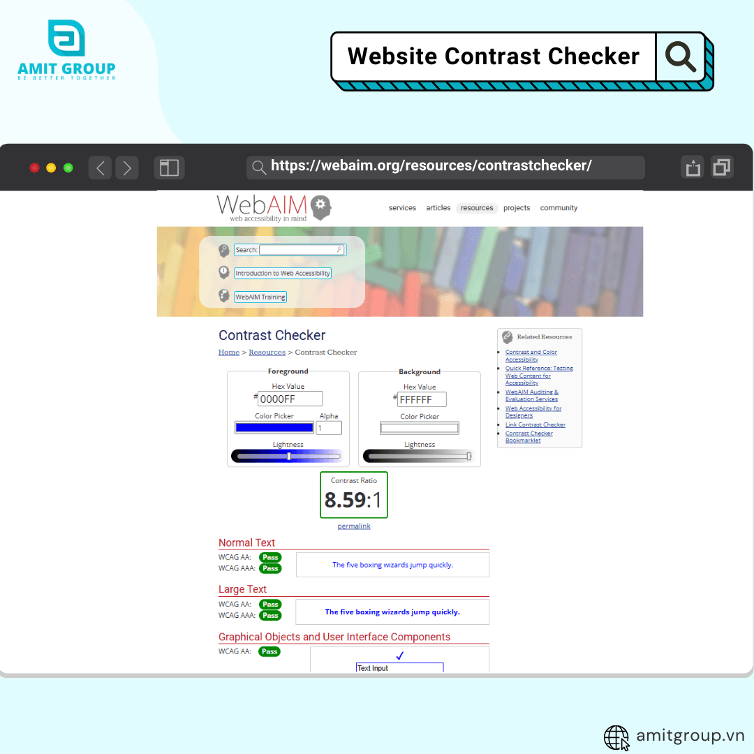
1. WebAIM Contrast Checker

WebAIM Contrast Checker is a simple and easy-to-use tool. To check contrast with this tool, you only need to input the background and text colors, and the tool will provide the contrast evaluation result.
How to Use:
Step 1: Access the WebAIM Contrast Checker
Step 2: Enter Color Codes
* Background Color: Enter the hex code of the background color.
* Text Color: Enter the hex code of the text color.
Step 3: View Contrast Ratio Results
View the contrast ratio results and the tool's compliance evaluation according to WCAG standards. The tool will display the contrast ratio and indicate whether your contrast meets the standards.
2. Adobe Color
Adobe Color is a powerful tool that helps you select and analyze colors for web design. Using colors appropriately not only makes your website more attractive but also enhances service and product delivery.

Step 1: Access Adobe Color
Step 2: Create a Color Palette
* Click on “Accessibility Tools”. You can manually create a color palette or click “Import Colors” to upload an image to check contrast ratios.
* Text Color: Enter the hex code of the text color.
* Background Color: Enter the hex code of the background color.
Step 3: Adjust Colors
If the contrast ratio does not meet standards, you can adjust colors directly in Adobe Color until the ratio meets requirements. Adobe Color updates the contrast ratio in real-time as you make adjustments.
3. Paletton
Paletton is a professional and easy-to-use tool that helps you check and create suitable color palettes for your design.

Step 1: Access Paletton
Step 2: Choose a Color Scheme
* On the image, you can see the options for color schemes at the top of the color wheel. These options include:
* Monochromatic: Select a base color and create different shades of that color.
* Complement: Create complementary contrasting colors with the base color.
* Triad: Create three equally spaced colors on the color wheel.
* Tetrad: Create four equally spaced colors on the color wheel.
* Free Style: Freely choose colors as desired.
Step 3: Select the Base Color
Use the color wheel to select the base color. You can move the cursor (round point) on the color wheel to change the base color. In the image, the current base color is red (color code #AA3939).
Step 4: Adjust Other Parameters and Click “Fine Tune”
* Hue: Change the hue by moving the cursor on the color wheel.
* Brightness: Adjust the brightness by moving the cursor within the color area on the wheel.
* Saturation: Adjust the saturation of the color.
Step 5: View Color Variations
On the right side of the interface, you will see different variations of the chosen color palette. These colors are displayed as color blocks for easy comparison and selection.
Step 6: Preview Color Palette in Different Contexts
Use the options at the bottom right of the interface to preview the color palette in different design contexts such as websites, articles, or other UI elements. Click "Preview" to see design samples.
4. Color Contrast Analyzer
Color Contrast Analyzer is a powerful tool that not only checks contrast but also allows you to analyze an entire webpage to ensure all elements comply with contrast regulations. This tool helps you identify accessibility issues and improve user experience.

How to Use:
Step 1: Download and Install
* Visit the Color Contrast Analyzer homepage and download the version suitable for your operating system (Windows or macOS).
* Install the tool following the instructions.
Step 2: Open the Tool and Select Area to Analyze
* After installation, open the Color Contrast Analyzer tool.
* Select the area on the webpage you want to analyze using the built-in screenshot tool.
Step 3: View Contrast Ratio Results
The tool will display the contrast ratio between the text and background of the selected area.
Checking and ensuring your website's contrast is not only a responsibility but also an opportunity to enhance user experience, creating a professional and user-friendly site. Using the tools and complying with contrast regulations are crucial steps to achieve this goal. Remember, a friendly and accessible website will help retain users longer and create a better impression of your brand.
Share post
Blog categories